Wednesday, March 30, 2011

WOYWW and Creative Flutterings...

Greetings to All,
Well, it seems like last week's WOYWW was months ago...almost years...forgotten what it's like... That is of course one BIG fat lie but I thought I would at least start off my post a little differently! For the Blogistical innocents out there, it's time for a weekly nose around many a workdesk. Join in here at Julia's. This is my offering for today...
 Life as usual - organised, immaculate and orderly. Actually, I've had a brilliant week. Saturday I gave a very relaxed and rewarding workshop, Sunday I hit Hobbycrafts and have spent all my spare time lost in the delights of my craft room. Pretty done in, but it's divine. Nothing overly-inspirational at Hobbycrafts so I spent most of the day on the other side at the Sewing exhibition. It was really amazing. Fabulous fabrics, designs, crafts, clothes, quilts, collages, embroidery and artists to name a few...loved it! So much so couldn't wait to start creating...so...

 This all started off as an ATC on Kraft card stock and just grew from there. As you can see all the wonderful things I saw this weekend show left their mark...fabric, stitches and textures galore! The back is an old book cover, lightly stamped with white Stazon. In reality the red satin ribbon is a lot darker and despite trying a million settings and apertures the camera just didn't like the sheen. So please imagine a luscious 1940's lipstick if you can!


Still in love with the Papillion stamp set and trying out every one of those beautiful butterflies! The great phrase stamp is by Paper Artsy. Just love to stamp on different surfaces...paper, fabric, mica and see what happens. Here I've used Archival ink on the fabric and then heat set it.
I'm entering the challenge over at Our Creative Corner - an ATC on Kraft with certain colours. I've gone for cream, chocolate and red. I've layered up the ATC on painted cardboard, adding colour and texture with Distress powders and inks.

I was surrounded by lots of scraps and trimmings and just allowed myself to play with whatever came to hand...all helped by the sound of Otis Reading in the background! As I was relishing in all these Earthy tones I also remembered the fabulous Bring Back Beautiful challenge over at Flourishes. There the theme is muted colours, so even with a hint of red, it still seems fitting.


A close-up of the ATC where you can see one of my favourite vintage lace trimmings which alas won't last forever...time to hit the flea-markets. A girl can never have too many trimmings.


So there we go...lots of big piccys for you to look at. If you saw my DT sneak preview from last week and forgot to check in Monday, well here is the Diva in question! More details here and a great Hats Challenge at Simon says Stamp & Show!


That's Wednesdays bulletin from La-De-Dah. Looking forward to a peek around all your desks and a big thank you for calling by.

Sarah.

Tuesday, March 29, 2011

Red and White is rather alright....

Morning...!
Just popping by with my weekly dose of Less is More. I think this great blog is definitely the "New Black" as they say, in the CAS card world, as there are now droves of us checking in each week. As always - really relishing the challenge each week...it gets my brain ticking and whirring along as good as any of my more detailed projects do. Also Mandi and Chrissie's passion for creativity and quality work is also a huge bonus - thanks ladies!

 This week I am totally in love with red and white. My sewing bug is also starting to tap at the door again so what better way to combine them all than with this card. The challenge this week is to use a tall thin card and a sketch. The card was actually longer at first, but I ended up snipping off the top 2cms or so as it looked far too long. Didn't measure - went by eye and feel. I had the idea for a few days and I'm pleased to say it turned out just as I hoped. The contrasting red and white colours do all the work for me!

 The gingham ribbon always make me feel nostalgic so this little stamp is just perfect to help echo a little 1950's feeling...

My ancient sewing machine can still run up a zig-zag and then I added a piece of red darning thread and then sewed the buttons on by hand. I hate to glue buttons - they don't like it either! Finished off with a little light inking around the edges and done!

Then in true Sarah style, I just had to do one more...although this one kind of had a mind of it's own...
I think that theoretically this one may not be eligible for the Beauty Pageant...sigh.
I have flipped both the card and the sketch but I love it anyway. So even though this is not an official entry, using a sketch is also about being inspired so... I can conclude that all is well.


A close-up purely because I just love looking at detail ! Not because I think I have expert stitching skills...

More scrumptious buttons. Only a ribbon and line of zig-zag on this one as the thread was too much.
Just a simple sentiment and this card is good to go...just like me!


Signing off...Hope you enjoy them. Do pop over to Less is More for more of more.

Thanks for visiting, see you again soon.

Sarah .

Monday, March 28, 2011

A Hat ??? Make mine a Crown...

Dearest Blogettes,

Morning all - hope this Monday finds you all happy, healthy and half-awake. I need the week to recover from my weekend...teaching workshops, visiting Hobbycrafts and my new DT piece for Simon Says Stamp & Show...the theme this week's challenge is "A Hat". So here is the full shot if you saw the sneak preview last week!
 I fancied a frolic in 50's fashion and veered straight for this stamp From Mr.T which I just love. She's such a glamour-queen and a bit of a Diva. So with that in mind and a little hat chat, I decided to go for a modern twist on the usual Mother's Day gifts! No flowers, butterflies, glitter or choccies, but a lady in need of some serious attention!

So the words Queen for the Day and a crown seemed very fitting indeed...and what better place to announce such a headline but on the old TV of course. The letters are all stamped and cut by hand and laid onto the TV image which I found in a vintage mag ages go - but just had to keep! Now I know why...

This was all I gave away last week - just love being able to stamp on Metal...
I have gessoed an old book page and then the image has been stamped and embossed with ultra-fine black powder. Love that glistening effect. Then went straight in with some pretty vivid red - but she almost demands it herself. Claudia Hellmuth Studio paints are just fab and they give really good results - watered down too!
I then tore and distressed the edges and layered everything up with some old brown paper, various polka-dot papers and another book page. Stopped half-way to do a few random rounds on the sewing machine! The red paper was a bit dull so I gave it a quick wash with the red paint - and bingo! - just right.Then it was onto my normal button and ribbon hunt for the perfect partners...

I then added some ribbons, ric-rac, buttons and of course two memo pins just for fun! Added a few more stamps here and there for an extra hint of the crown...I then decided I needed the mini metal tag and clip for a little bit of a sparkle and shine

So see - a lot of fun to be had in the hat department. I really hope you like it. More importantly I hope you feel inspired to create your own "Hat" piece and share it with us... So put your thinking cap on (see - free hint there...) and show us what you've got!!!!
You might even end up as A Top Three Winner  or be the lucky person that gets $50 worth of stash.
Be sure to check out the other DT pieces here!

Looking forward to seeing your work,


Sarah.

Wednesday, March 23, 2011

WOYWW, For the Fellas and waffle...

Hello Mercredi, woensdag, miércoles, Wednesday...
Hands up if you remember the weekend. It did pop round to my house but didn't have time to come in for a cuppa so we only chatted on my doorstep. Anyway, back to the mid-week mutterings with a shot of my desk. Looking pretty tidy as I had just cleaned up one mess to make room for a new one...
Just starting on some vintage cards but leaving them until tomorrow. Despite owning a zillion design papers it seems the right shade of brown just ain't one of them.


 So, I could be a very good girlie and get this (today)...
 ...looking like this again (Sep 2010). But I didn't.
(Julia - I hope you now can now go into major gloat mode). I am pretty strict on keeping things tidy in my room, but this ravage of ribbons is my teenage kid...it just won't listen.

So with no vintage success or any ribbon joy, I decided to turn my efforts to the Less is More Challenge where the theme is a rather daunting sounding Masculine, or as I prefer to say ...something for a fella. Yes, that obscure and floral free genre we tend to avoid. I decided to go for a modern take on the theme, have fun and rustle up my own decor...

 I played around on the Mac with words and fonts and designed my own paper with the words Rockstar, Hero, Lover... should cover a few avenues in life. Then I cut out three circles, glued them onto card for strength and inked the edges.


Just layered them up with a brown cotton ribbon onto textured green card and there you go.


 Number two...I really wanted to use this male symbol and it made me laugh. Decided to go for the parallel-legged man, as opposed to the wide-legged one - as I wasn't planning on crafting a new toilet sign!!!

I would have liked to have tried out other ideas with this chap but seeing as he had to be hand-cut and painted each time, I took a rain-check. Went for Kraft card-stock this time...which is great with the colours of the words. Is it the world or a giant football? Who knows? But could I send it to a fair gentleman. Me thinketh so...

I will leave you with a sneak preview of next weeks new Design Piece for Simon Says Stamp & Show. The idea is that you now gush "Oooh, that looks so darn intriguing, I will just have to come back..." See you Monday then!

 This weeks challenge is Show us a Word...and my DT piece is on the left. More details here...If you're feeling creative and up for a good challenge I would love to see there. That's the gossip for today. Enjoy yourselves wherever you may be. Thanks very much for calling by...and so many lovely comments. Thanks to all of you!
I'll be around soon too.

Sarah.

Monday, March 21, 2011

Homely Musings and Simon Says "A Word..."

Lo! Monday morning visits our doorstep once again...
The new theme over at Simon Says Stamp & Show is "A Word." I'm starting off the week with a new Design Piece and the well-worn but, oh so true, There's no place like home...
It is hard to close your eyes to the recent events in Japan and I started realising how precious the safety and sanctuary of my home really is. I cannot imagine how it is to lose everything you own in just a few minutes. Maybe all we can give at present are our thoughts and prayers, but they too are wanted and needed. The word home stayed with me all week and inspired my new piece.

Thoughts of little paper houses and wood felt right...something about the natural materials and earthy tones. I wanted to create my own individual houses but also wanted them to have some dimension. Somehow, my random curiosity resulted in me teaching myself some origami and I set about making 5 different homes!

Each one uses a different type of book page that has been aged with Distress Ink, stamped (Tim Holtz range) and sealed with matt medium to add strength. They are so dinky and fun to make, with each one having it's own personalty...yes, really...they talk to me.
I then started to play around with adorning each house with a little something for interest and contrast. Just a couple of buttons or an eyelet make all the difference (they will let you know if they want to wear it).
  

Here I have used just one flower punched from a metal scrap. I also started playing with laying ribbons and braid behind the homes to see how the colours and textures were looking...
The words have been typed onto Sticky-back Canvas, aged with a touch of ink and stuck onto paper scraps.


Here is "home" - the smallest but sweetest little house on the block! I don't often do heart brads but I let myself go. It was a gold brad but I dipped it into some alcohol ink for an instant makeover! You can also see the flower in the background. Just the one biggie. I used the tattered-floral die with various materials and a vintage pearl button.
The wood is a slat taken from one of my vintage apple crates (alias my telephone table...!) I decided to just go for it and wing it with some stamping straight onto the wood. I went for Sepia/Coffee Archival inks and they worked perfectly. It adds just that bit of extra contrast and pattern without detracting from the natural beauty of the wood. I also salvaged the old nails from the crate and decided to add them as a quirky touch. Yummy - just loving the brown hues there...

Once I had chosen all the positioning and background ribbon/lace, it was time to fix it all securely with the darn sticky, but best-ever Wondertape - so nothing will be going walkies.This was all a bit different to my usual thing but I loved the challenge and journey!

So that's me for today... I am so ready to crash out for the night.

I really hope you will join in our challenge and show us your word. Everyone must know at least one word - so what are you waiting for...??? You might just be in our next Top Three and Simon Says Stamp are giving away another $50 shopping spree! So, plenty of reasons to join in with the fun. Head over to the blog to see more and truly wonderful DT pieces. You'll love them. Hope to see you there...

With love and homely, happy thoughts,

Sarah


Thursday, March 17, 2011

Less is More - A Little Love in the House...

(WOYWW visitors - see previous post - this one too if you like...Thanks!)
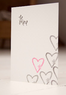
Yesterday I was looking forward to the simplistic pleasures of another Less is More Challenge and here I am a day later with my take on "Off the Edge". Those of you that know me, have already encountered my "Gotta do more than one" thing...so here is another trio for sharing. As said, it's all a little lovey-dovey. I had some ideas doing the rounds in my head and these small stamps seemed just the ticket...


Now ladies - for all those with whitespaceaphobia, this is as minimalistic as it gets...no brad, ribbon and I didn't even ink the edges! Just stamped the sentiment randomly over the corner with just the one in red.
The letters look rather like that of an old type-writer so I felt I could wing it by hand and not go all precise with the spacing. I think it works and I like the slightly uneven look...like someone just played around in the office. I like how the stamp is the pattern, decoration, sentiment and the focal point! The card-stock has a slight texture. No need for any extras.
The second one follows the first in some ways. As the heart was a little bigger I didn't need to use so much repetition but it did need it's own sentiment, otherwise it would have been just a pattern. It also helps to balance out the proportions of the rectangular card. I used a small clear stamp set I picked up for a pound in a bargain bin last year! The card-stock is the fabulous dotty one from Bazzill.
 The third one was made using glossy card stock. I debated the joys of slipping off this one just at the crucial moment but wanted to go for the shine (hard to see on the piccy). I used Archival ink, not Stazon, as it is less wet and gives more control. It takes longer to dry but it was worth it...
I did hold my breath for most of the stamping and gave myself a wee round of applause after doing the sentiment. This time I added a smaller heart for contrast. I will confess that this is the second attempt, as I botched the very last stamp on the first one - booooo! Almost walked away but couldn't resist the challenge to get it right. Puffing and patience work every time...
So there we go...all done and dusted again (well -  done, dusting...that's for another day). Head on over to the Less is More blog and have a look at the examples by Chrissie and Mandi as well as some great entries this week. Don't forget to read the guidelines first...the ladies are working very hard to achieve a great blog, challenge and level of work. It is also very enjoyable too - getting back to basics and simplicity are good for you. Just need to apply that to real life now!
Oh and this little shot shows the post-it note beginnings of today's adventure...
Thanks for calling by - hope to inspire you in something, somewhere! 

Sarah.

Wednesday, March 16, 2011

WOYWW or Let's do the Timewarp again...!

I'll start with hello Wednesday as opposed to good morning...I have lost all sense of time now and it is 2am on Wednesday morning and I have only just started this post. For the newbies, welcome! and the utterly confused...pop over to Julia's to get the drift...
Got up early today to have time to do everything and here I am later than ever. Deary me. I'm surprised it's not me lying on that old desk. Give me a piece of Cut 'n' Dry for a pillow and I'd be away...This is my desk after clean up part one. It was so bad I had lost half my pieces for my canvas...
 I spent all day playing in my craft room - a canvas just for me...divine - but that's the problem, I just kept on playing and there you go - the whole day was gone. I had a right hassle getting the right light for my photos and ending up doing a second shoot in the old kitchen (boooo). Might try again later (update - have done so!) ...then during my Bloggy efforts, Google informs me I have to "buy more space" and halted my uploads. Sigh...Starting all over again...Enough melancholy, what did I do all day then?

I just felt like using all the things I love...stamping, paper, vintage ephemera, collage, paint, fabrics, lace, buttons, flowers...and...well you get the idea. I love it all. This canvas is 8 inches square and just the right size to delight oneself all day. I started by painted it cream and adding some stencilling before diving in to layering heaven. 

I have used pages from old poetry and music books. I just love the butterflies from the new Tim Holtz range. Don't normally rush to buy new stuff - but they are just wonderful. That cherub from an old music book is just as perfect. The young girl is a photo stamp  - tricky things - and it took quite a few attempts to get it looking right.
I just kept tearing, layering and playing until I felt comfortable with the colours, textures and composition. Then I moved onto all the decoration and embellishments. I am hooked on making my own flowers and the big green one is made from vintage lace and fabric. No wonder I am still awake...
I finished the piece with some ribbons, lace trimming and buttons. I felt it needed a little bit extra so I added the metal tag, eyelets and gold thread. I added some touches of Inka Gold crème along the paper edges and canvas for some sheen. Just as I was done I decided to type a little snippet and laid it under a Mica scrap. So there you go. A little unintentional Mother's Day inspiration for you!
That was my oldy worldy experience for today. I will enter it into a few challenges later today - when I have had some sleep, that is...
 Tomorrow onto the Less is More challenge for some solace in minimalism. Also a quick shot of my new Design Team piece for Simon says Stamp and Show (Have you joined in yet??? Plenty of great challenges, inspiration and prizes!!!)
This is me signing off good and proper. I will be doing the desk-hop later (all be it in my PJ's...) Thank you so much to all my visitors last week. I read all the comments...I am thankful to all my followers new and old and really appreciate your being here! Thank you again!

See you later,

Sarah x.