Bonjour! C'est moi,
I've been away all weekend having a great time at the Artsy Crafty weekend, so what do you do when you come home from such an intensive session? Well, do it all over again in my case. I've been finishing off the weekends projects (I am never done in time) and also playing around with two ideas that were tugging at my sleeve. Firstly my take on the
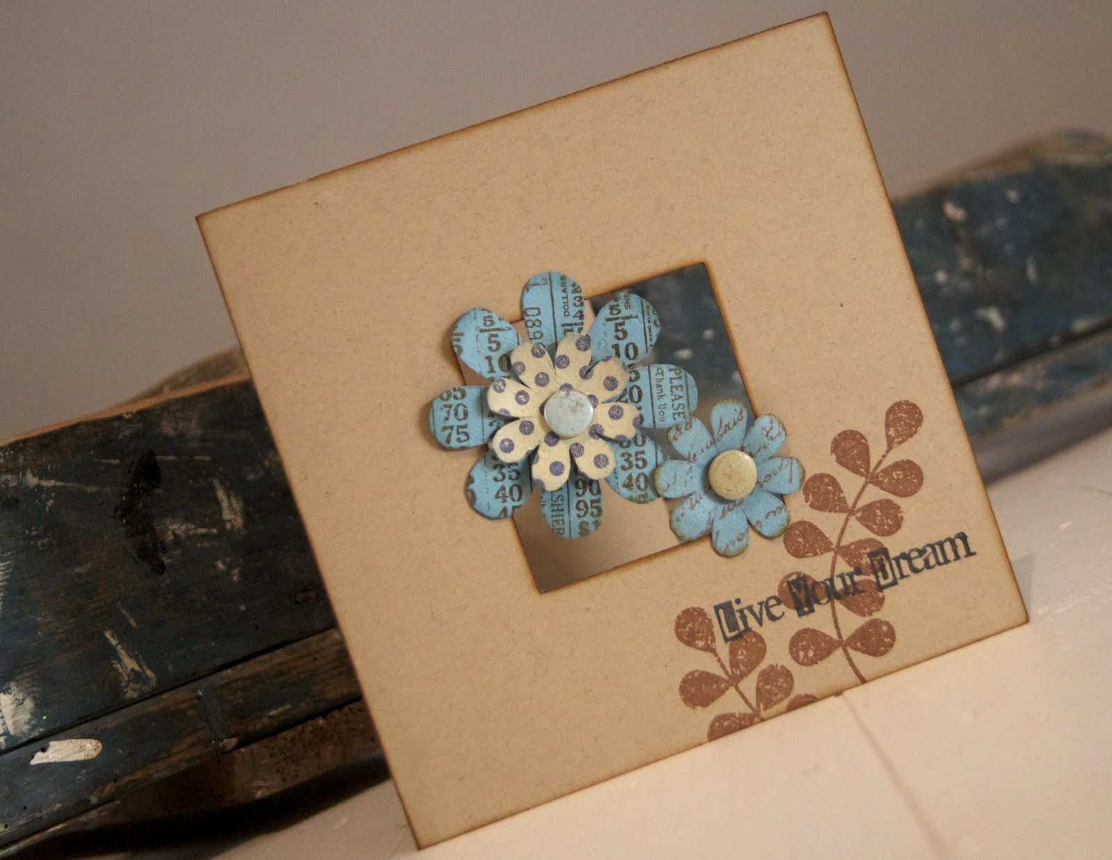
Less is More challenge, where we can choose from 5 square areas for our focal point.
I think you can figure out my choice for yourselves! I wanted to have a go at a clean and simple card a la Wendy Vecchi style. I think her bold yet simple stamps are very versatile and lend themselves to many different projects. I have cut a window in Kraft card stock and inked all the edges. I did fancy a corner window as I prefer off-centre, but I thought the flowers might be too heavy and wasn't sure if the proportions would work.
I stamped the flowers onto Grunge paper, painted them with Claudine Hellmuth studio paints and then stamped again with Archival ink. I used the Live/Be Happy and make Art sets and the leaves are from the Love to make Art set. The polka dots are by Darkroom Door. I've slightly inked the edges and added a couple of old tatty buttons for the centres. I was just able to attach a few petals to the card without any hidden support.
I felt the corner looked too bare with just a sentiment. Stamping the leaves in Sepia ink balances out the browns and blues and the whole card. I'm very pleased with the outcome as it's what I had in mind and I'm glad to be able to use my Wendy stamps on simple cards too.
That was all so much fun I moved straight on to my next project...
Last week I was busy getting my DT work done before my weekend event and just couldn't find time to join in with Challenge 14 at
Everything Wendy Vecchi. Booo...! The task involves a card, a chipboard circle with an ATC and if there's one thing I love it's an ATC. Just making the deadline by a whisker, but I had to have a dabble. Hooray...! This is actually a mini canvas coloured with Distress Stains because, could I find the right brown for the background amongst the unknown depths of my paper stash...??? Could I heck as like. Sigh.
I didn't plan on doing the brown tones at all, but sometimes a piece tells you where it wants to go. I created the background by stamping the leaves onto textured card stock and then blending Distress ink over the top. Rather like it and love the dog tooth Graphic 45 paper which was a great contrast and boost. Mr. Birdy is enjoying a moment on the scallop!
The Art Parts flower had been inked with Rusty Hinge. I used the ink pad directly onto the flower and got a great rich colour. I then stamped the script in white Stazon and applied more ink with a blending tool to soften the effect. I wanted to place the sentiment behind a distressed frame and make the ATC look like a mini picture. Added just three press studs as I wanted to keep things pure. After a slow start struggling with colour choices, things went really swiftly and a good night was had by all.
So that's me all done. Just want to say I hope you like them and thanks for dropping in!
See you around soon,
Sarah.


16 comments:
not one masterpiece...but 2!
very very nice work!
wendy
gorgeous creations! Love your first card! I love how you have used the apature, and your creative use of kraft ... love how you have inked it!! HUgs Juls
I like the artsy way you have done the flowers and I'm a sucker for aperture cards.
Glad to hear you had a wonderful weekend . Beautiful creations and as ever beautiful coours and stamping so beautifully crafted.
Marie
just beautiful xx
Beautiful cards. The blue looks great with the kraft, and I love the aperture. xx
both great but adore the first one!!
Lovely! The blue flowers just pop on that card! I want to try to cut some of these out of the grungeboard I have.....
Reading about the week-end here and there it sounds fabulous, again!
Smashing cards love both of them, great work as always XOXO Zoe
Gorgeous cards, love the aperture in the first one.
These are both great! I especially like the different patterns/text you used on the flowers on the top one. Love that you mixed em up.
Both VERY nice indeed
Kathyk
Fantastic cards! A lot of effort but it pays off. The aperture idea is great! TFS.
Linda
Two great cards, love the LIM one though. Carol x
Looks like you grabbed two squares here Sarah!
I love those flowers, your work is always so inspirational!
Thanks so much.
Chrissie
Lady LIM
"Less is More"
Beautiful cards here, Sarah! Love the aperture card!
My card is HERE
Post a Comment