Tuesday, June 21, 2011

Just Good, Clean (Girly) Fun...

Hello to one and all,
Well, the past week went by in a flash because here I am again, on a Tuesday again, with a little something for the new Less is More challenge for CAS cards. My weekly dose to balance out the brain cells...After a very intensive weekend up to my eyes in metal and ink with a DT project, I was just itching to get onto these and embrace some white space and simplicity. The theme is Monograms...not to be confused with abbreviations which was kind of tempting too.
I uuhmed and ahhed for a day and wasn't blown away with the idea of my own initials so I've gone for a "Monogram mood". My letter and it's inner decoration represent the feeling you want to convey, along with a sentiment that also contains the same word in full. Firstly, I chose a letter font that would make a good stencil. This is Kingthings which I like for the curves and modern look. I enlarged it on the computer, printed it out and then cut out the inside. I lay it on my card front holding it steady with a little tape and then stamped the small images with White Stazon. 

I gave it a quick dry holding on like mad to the stencil and then sponged over the top with Stormy Sky Distress Ink. I was huffing, puffing and hoping the stencil would stay put and be nice to me, not daring to peek until all was done. Call me mad, but I get pretty nervous at such a point and then utterly elated when I discover all is well! I was really pleased with the crisp edge and fun feel of the image. I then stamped the simple ssentiment (holding breath) in Black Archival ink.
My second one is done using Barn Door Distress Ink which is very vibrant indeed but looking sassy. Red, white and flowers make me happy. I used linen effect card stock but opted for the smoother side to get a better coverage of ink. I could have buffed the Stazon images to remove a little Distress Ink, but I really liked the faded effect as it was. The mini-stamps are just tiny 99p sets I picked up in a bargain bucket. The sentiments are by Hero Arts - Heartfelt Messages.

And if you also happen to know someone called Hattie or Lilly then you've got yourself a two-fer. If Lilly was learning to drive, make it a three-fer! But on a slightly more serious note, it is an idea you could play around with for a simple yet personal Birthday or Celebration card or even a Journal cover.

That was my inking and thinking on Monograms so I'm signing out. Thanks so much for calling by,it would be great to hear from you if you have time.
Tarraaa!
Sarah.

Monday, June 20, 2011

Loved...

Good Morning,
Welcome...I hope the new week finds you all on good ground. I'm here to share my new creation for Simon Says Stamp & Show where it's all about metal. Metal may sound very modern I'm taking you on a nostalgic walk down Memory Lane. I just love vintage images but there is something very precious about those of your own family and for a long time I've wanted to create a keepsake of my own heritage. Last weekend I enjoyed a good rummage through my mum's photos and came home with a wonderful selection to choose from.
The idea of generations really appealed to me and I found three images that fitted together beautifully. My mum looking very sweet, my much loved Nanny and my elegant Great Grand-mother. They were to be the focal point of the entire piece.

I created three hanging frames by altering three candy tins. No, I am not addicted to Hello Kitty sweets but they caught my eye whilst waiting in a long queue at the corner shop. I sanded off the original paint and then gave them a good bathing in several shades of Alcohol Ink. I took a while to get them covered and it is best to do one colour at a time otherwise they wash each other off. I also used a very old paint brush to get the inks all over the tins. Needless to say, days later I am still scrubbing my rusty fingernails...

I scanned and printed the original photos, altering the size to get the right sizes and proportions for the frames. This turned out to be a tricky old job but I had set my heart on these three images. I aged them with Vintage Photo ink and also cut a "glass" front from Mica which made them complete. A cardboard frame is covered with Ten Seconds Studio Metal which I embossed with the Textile folder. I then used lots of alcohol ink, followed by a light sanding to enhance the detail.

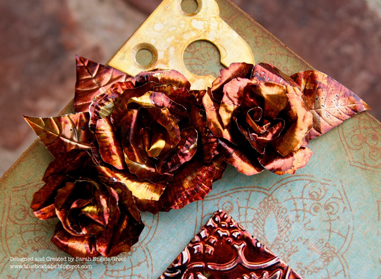
I covered some chipboard with K & Co paper, sanded and inked the edges and added four metal corners. I'm not always so quick to use a ready-made Design paper but this was perfect in every way - just like vintage wallpaper. I made three rusty roses using more metal, Alcohol Ink and the Tattered Florals Die. I scored lines on the petals with my tool kit before inking them up. I tarnished them over a gas flame - hold them there a second too long and you get a fizz, a puff of smoke and all the copper colour falls off... (don't try this at home kids...) Check out some fabulous flower tutorials by Laura Denison and Lin Brown.

 Whilst all this was going on, I had stamped the word LOVED onto tiny paper circles, placed them under a charm clip and filled them with Glossy Accents. I glued just the heads of some brads to the clip tops and when they were completely dry and clear I glued them all to the frame as it would have been a fight to drive a real brad through that metal! I added a length of copper thread underneath them for more definition.
I did then play around with some other decorative ideas but I kept coming back to this design feeling it was right to keep things pure. These three beautiful ladies can hold their own and it's all I want to admire too. It was quite a voyage of discovery and I'm really pleased with the outcome. It definitely a different feeling when you work with those you know. It was quite hard to photograph as the light just loves bouncing off the metal but I hope you can enjoy the nostalgic mood too.

So there you go, another story all told. I hope that you are feeling inspired and will maybe dig out some family history too. There's so much you can do with metal - vintage or ultra modern, just take a look at the Design Teams fabulous ideas over at the Simon Says blog. Every week you have a chance to be awarded the coveted Top Three Title and a $50 shopping spree.
 
Looking forward to seeing your take on the challenge. Thanks for visiting, I would love to hear what you think, so do drop me a line...be seeing you all soon!

Sarah.

Sunday, June 19, 2011

Just me and my Shadow...

Hello folks,
Well, the hubby is on a French School trip for a week, I'm ignoring the housework, no work tomorrow and have been playing around in my craft room all day. Cushdy day all round. Just sharing a small piece I've put together for the challenge over at Everything Wendy Vecchi. The original concept from her Making Art! book was a hanging using ric-rak, ball chain and a circle on a square. I've gone for a 5 inch canvas which is just perfect for a few hours dabbling in the afternoon.
I covered the mini canvas with DP, sanded the edges and added Rusty Hinge Distress Ink to the edges and the paper. Stamped a few leaves for a base. I cut and stamped the circle by hand, sanding again to get a smooth finish. It's hard work cutting a decent ring out of cardboard. Just loving the polka dots...

 The flower is an Art Parts piece coloured with Claudine Helmuth paints and Brilliance Ink. Added a metal flower and button centre. The little house is part of a larger Wendy stamp and I've also added the word home to the front. You can also see the ball chain which came off a candy tin and has been dyed with Alcohol ink. Spent all day yesterday working with Alcohol inks for my new DT piece and my hand and nails look abysmal. Never mind a Rubbie Scrubbie, I need an electric sander to get this lot off.

I stamped and embossed the butterfly, cutting it out so he could perch on the circle edge. I layered it all up to create more dimension and added some ric-rac, weaving it through the circle. Just thought I'd create a little summer feeling seeing as we haven't seen much of it this week...

That's me all done - see you again tomorrow with my Simon Says DT post. Thanks for calling by and if you doing the Dad thing - enjoy yourselves!

Sarah.
Joining in with the following:

Sweet Stampin" Challenge - Things with wings
Polka Doodles - All of a Flutter 
Simply Create - Fly with Us
The Stamp Man - Butterflies and Dragonflies
Anything Goes Challenge Blog - Here comes the Summer
The Cheerful Stamp Pad - Things with Wings

Thursday, June 16, 2011

A Little Pre-weekend Inking

Greetings!
As the title says - just flying by before the weekend kicks in because we all know how fast they like to zoom by. Here's my take on the new episode over at Studio L3 hosted by Linda. I like to think of it as mix between a laboratory and playground where you can delve into the techniques, inkiness and history of  Mr. T. Holtz. Take a look the demo and grungy gossip here to see how you can conjure up a little faux batik. It's a really great technique and my iron saw more action in one night than it has all month...

I stamped the doily in Wild Honey and after the embossing bit I went on to use Rusty Hinge, Scattered Straw and Brushed Corduroy. I love the lacy detailing of this stamp (Hero Arts) and how it's come out with these tones. I got a great lace effect on my brown "soak-up" paper too. So two for the price of one! I added a bit more colour as the heat does reduce the colour slightly and then stamped a little mesh in the back ground. The Paper Artsy girl in an old but well-loved image stamped in Plum Archival, followed by some buttons embossed with Distress Powder.

 I added an old fabric scrap and a whiff of metal with a butterfly. She has received a liberal dose of alcohol ink and burnt Distress powder. It was a charm but I managed to cut the loop off which looks so much better. I felt I wanted to stay within the same tones and so I've also joined in at The Artistic Stamper where it's Monochrome, plus one colour.

 Seeing as there were a few wings around I  stamped Fly Away onto a Mica snippet and placed it with some ribbon trimmings underneath my flower. I cut lots of individual petals and gave them a swirl, scrunch and swish in distress ink and Glimmer mist. I then built them up into a flower and added a press-stud centre. As always, spent more time bashing it around than making it! I added some copper thread, ribbons to the top and then finished off with a serious session of edge distressing and Black Soot ink. I'm always amazed how a touch of black ink can just tweak the mood of piece, and allow the G in Grungy to be a little stronger than the G in Girly with this tag.

So... that was the creative newsflash for Thursday. Do hop over to Studio L3 and visit a few of the arty folk out there. It's really good to see so many inspiring and individual creations!
See you and the weekend very soon...
Sarah.

Wednesday, June 15, 2011

What Pretties Doth Lavish Thy Desk...?

Hello there,
Good morning and a big welcome to Desk HQ, where we're half way through both the week and June. C'est incroyable mes amis! So, here I am to flaunt my desk, as we all do at WOYWW hosted by wonderful Julia at Stamping Ground.
In the photo it looks fairly sane but in reality it is pretty dire, and also spreading its wild wings  throughout the entire room. I'm still awaiting a burst of domestic thunder to instigate the big clean-up... I had just done a Grungy tag and was working on a Father's Day card after doing a tag. Quite often you're so busy with projects and stuff, family cards get left on ice, but I felt my Dad deserved a decent offering.

Nothing too flash, grungy or quirky for Pa, but good old blokey colours and a touch of humour. If I do something too altered or edgy he'll think it went wrong or ask why I didn't finish it... This is a spin-off idea from a recent DT piece and I'm quite pleased with the end result. My Dad is a retired car mechanic who worked in the same garage for 50 years! He can tell what's up with any car engine just by listening. A computer whizz he is not, so the chances of him seeing this here are less than me winning the Lottery or sorting out my ribbon box.

I'm also having a great time following the on-line collage course from Claudine Hellmuth. She's a fabulously enthusiastic teacher and the course content and atmosphere is brilliant. Here is my take on a horizon line collage. They can do a lot in the medical world these days and I think it's high time they pondered the benefits of flip-top heads for husbands. I could delve straight in, pull out an old conversation and say, "See, I did tell you..."

No news on the arrival of my WOYWW Pif yet (it does have to get to The Philippines), so keeping that for next week. This week I'm going to be working hard on MY MOJO MONTHLY, getting all the technical tricks on the go...eeek! I shall be doing battle with Blogger as I attempt to activate photo buckets, pdfs and linky things. Could be a long week.

Anyway, that's this weeks episode of Blog Soap...thanks for dropping by. Glad you were here. Hope you have a really good week - or at least a few top moments if you're busy.

See you soon, off to have a nose around...
Sarah.

Entering my Card into the following Challenges:
The Stamping Boutique - Men Only
OLLCB - Father's Day
Stamp'n'-Doodle - Father's Day
Creative Inspirations Challenge - Father's Day
Secret Crafter - A male card

Tuesday, June 14, 2011

The Sweeter Side of Life...

Hello there,
Sarah checking in on Tuesday with my Less is More dabblings, which seems to be turning into my regular LIM day. This week we are onto One layer Stamping with an "In the Frame" theme. I often profess to not doing cute, but I can succumb to a bit of sugar and this week definitely displays that soft place. I was thinking of using a house frame of some description and I was also browsing through all my stamps and came across a little set from Crate Paper that is just so appealing in its simplicity I had to use it.

Firstly, I cut my own house shaped stencil from card and then sponged Distress Inks onto textured white card. Kept a strict eye out for contaminated fingers and ended up with cramp in my hand from holding everything in such a weird position.
Then I stamped the leaves with Brilliance Dew Drop Ink in Pearlescent Ivy. I have quite a few of these pads lying around, rather unused of late. I'd forgotten how crisp the colours are and how handy they are for inking up smaller stamps. I added a little birdy at the side, a blue flower sun and the words HOME inside the house. I used Plum Archival as it doesn't bleed into the Distress Ink and it is less harsh than black. LOTS of white space but I prefer that with one layer stamping...ink and paper... and you're all done.

Here's a sibling.The sponged house is more graduated this time.This is my second attempt and I must admit to taking down my original post late last night and redoing this one in the very wee hours. The stencil had bled a little and it just bugged me so badly I could not abstain...

This time I stamped the word Home vertically. I do like the mini alphabet peg stamps, and they're just perfect for this type of card.

So that's all folks for now. I'm off to grunge and distress another project and visit the other side of my inky mind. Thanks for visiting, do check out all the other cards as there's a feast of creativity to be found.

Will be doing some blog-hopping today, so see you very soon!

Sarah.

Monday, June 13, 2011

Oh So Tattered and Torn...

Hello everyone,
Welcome and nice to see you all again. Are you ready for a new week of creative dabblings? Our summer has taken a right nose-dive but that can justify more crafty lock-ins! It's Monday so time for a new theme over at Simon Says Stamp & Show where it's all about torn and distressed edges. Well, that sounds like pure music to my ears and I totally indulged myself when making a card for my sisters special friend...a someone who cherishes her faith and the significance of butterflies. I just love these muted vintage greens and brown and decided an easel card would make things extra special.
I painted an old book page with Claudine Hellmuth's Gesso and then stamped the Papillon butterflies in Coffee Archival to achieve a crisp and well defined image. I tore and inked up the edges and then worked on building up the layers...Some people think layering is a tough job. Sometimes it works immediately or sometimes takes a while! It's trial and error - just keep putting on, taking it off....see which layers add interest, variation and contrast. I've used vintage pins on the book page scrap as well as stitching around some of the papers  - great fun! Distressing, inking, sewing, creating - what more do we need? (except time and new stash).
Here you can see how much I enjoy tearing and distressing. I have only used Vintage photo ink on this card which transforms the mint green into a fab shabby hue. I've inked up a silver frame with Alcohol Inks, stamped a sentiment and then placed it all in the frame adding a Mica scrap to the front.

More close-ups! Just showing off two beauties from my vintage button stash...love how they come - all bashed up for me to use. You can see I've also used lace doilies, scraps of design papers, Glassine Kraft paper and my faithful 'go to' friend - my gold thread. To finish off I generated a sentiment on my computer and matched the letter font to the framed stamp. Added lots of yum scraps and small ribbon trimmings to complete the card.


So, there you go. A good old-fashioned but very well-loved style of mine...and where I started out 4 years ago. I still really love designing and creating cards and I hope this one might give you a few small light-bulb moments.
Head over to the Simon Says Blog to see more fabulous pieces from the Design Team and also check out The Superstore to see how you might spend the $50 Prize Draw shopping spree!!!


Looking forward to seeing your creations - last week you were all Super-Duper!!! Take care and thank you so much for the visits, followers and new faces - all are so welcome. So have a great week whatever you do...
Sarah.