Thursday, March 17, 2011

Less is More - A Little Love in the House...

(WOYWW visitors - see previous post - this one too if you like...Thanks!)
Yesterday I was looking forward to the simplistic pleasures of another Less is More Challenge and here I am a day later with my take on "Off the Edge". Those of you that know me, have already encountered my "Gotta do more than one" thing...so here is another trio for sharing. As said, it's all a little lovey-dovey. I had some ideas doing the rounds in my head and these small stamps seemed just the ticket...


Now ladies - for all those with whitespaceaphobia, this is as minimalistic as it gets...no brad, ribbon and I didn't even ink the edges! Just stamped the sentiment randomly over the corner with just the one in red.
The letters look rather like that of an old type-writer so I felt I could wing it by hand and not go all precise with the spacing. I think it works and I like the slightly uneven look...like someone just played around in the office. I like how the stamp is the pattern, decoration, sentiment and the focal point! The card-stock has a slight texture. No need for any extras.
The second one follows the first in some ways. As the heart was a little bigger I didn't need to use so much repetition but it did need it's own sentiment, otherwise it would have been just a pattern. It also helps to balance out the proportions of the rectangular card. I used a small clear stamp set I picked up for a pound in a bargain bin last year! The card-stock is the fabulous dotty one from Bazzill.
 The third one was made using glossy card stock. I debated the joys of slipping off this one just at the crucial moment but wanted to go for the shine (hard to see on the piccy). I used Archival ink, not Stazon, as it is less wet and gives more control. It takes longer to dry but it was worth it...
I did hold my breath for most of the stamping and gave myself a wee round of applause after doing the sentiment. This time I added a smaller heart for contrast. I will confess that this is the second attempt, as I botched the very last stamp on the first one - booooo! Almost walked away but couldn't resist the challenge to get it right. Puffing and patience work every time...
So there we go...all done and dusted again (well -  done, dusting...that's for another day). Head on over to the Less is More blog and have a look at the examples by Chrissie and Mandi as well as some great entries this week. Don't forget to read the guidelines first...the ladies are working very hard to achieve a great blog, challenge and level of work. It is also very enjoyable too - getting back to basics and simplicity are good for you. Just need to apply that to real life now!
Oh and this little shot shows the post-it note beginnings of today's adventure...
Thanks for calling by - hope to inspire you in something, somewhere! 

Sarah.

Wednesday, March 16, 2011

WOYWW or Let's do the Timewarp again...!

I'll start with hello Wednesday as opposed to good morning...I have lost all sense of time now and it is 2am on Wednesday morning and I have only just started this post. For the newbies, welcome! and the utterly confused...pop over to Julia's to get the drift...
Got up early today to have time to do everything and here I am later than ever. Deary me. I'm surprised it's not me lying on that old desk. Give me a piece of Cut 'n' Dry for a pillow and I'd be away...This is my desk after clean up part one. It was so bad I had lost half my pieces for my canvas...
 I spent all day playing in my craft room - a canvas just for me...divine - but that's the problem, I just kept on playing and there you go - the whole day was gone. I had a right hassle getting the right light for my photos and ending up doing a second shoot in the old kitchen (boooo). Might try again later (update - have done so!) ...then during my Bloggy efforts, Google informs me I have to "buy more space" and halted my uploads. Sigh...Starting all over again...Enough melancholy, what did I do all day then?

I just felt like using all the things I love...stamping, paper, vintage ephemera, collage, paint, fabrics, lace, buttons, flowers...and...well you get the idea. I love it all. This canvas is 8 inches square and just the right size to delight oneself all day. I started by painted it cream and adding some stencilling before diving in to layering heaven. 

I have used pages from old poetry and music books. I just love the butterflies from the new Tim Holtz range. Don't normally rush to buy new stuff - but they are just wonderful. That cherub from an old music book is just as perfect. The young girl is a photo stamp  - tricky things - and it took quite a few attempts to get it looking right.
I just kept tearing, layering and playing until I felt comfortable with the colours, textures and composition. Then I moved onto all the decoration and embellishments. I am hooked on making my own flowers and the big green one is made from vintage lace and fabric. No wonder I am still awake...
I finished the piece with some ribbons, lace trimming and buttons. I felt it needed a little bit extra so I added the metal tag, eyelets and gold thread. I added some touches of Inka Gold crème along the paper edges and canvas for some sheen. Just as I was done I decided to type a little snippet and laid it under a Mica scrap. So there you go. A little unintentional Mother's Day inspiration for you!
That was my oldy worldy experience for today. I will enter it into a few challenges later today - when I have had some sleep, that is...
 Tomorrow onto the Less is More challenge for some solace in minimalism. Also a quick shot of my new Design Team piece for Simon says Stamp and Show (Have you joined in yet??? Plenty of great challenges, inspiration and prizes!!!)
This is me signing off good and proper. I will be doing the desk-hop later (all be it in my PJ's...) Thank you so much to all my visitors last week. I read all the comments...I am thankful to all my followers new and old and really appreciate your being here! Thank you again!

See you later,

Sarah x.


Monday, March 14, 2011

Monday, Monday and new Design Team piece!

Rise and Shine...'tis Monday morn!
Yes, indeed it is. Another new week and the chance to show you my new Design Team piece for Simon Says Stamp & Show where it's all about stars. Let's take a trip back to 1950s Hollywood and indulge in a little glamour...
I started with my background sticking torn pages from a vintage magazine onto an old book cover. I glued them with Matte Medium, swiped with Gesso and then stamped random blocks of stars with a large stamp. I like the translucent quality...you can still see the magazine images underneath! Then I set to work on the marathon task of creating all the loose elements. I cut all the larger stars by hand and covered them in American flag paper (which I made myself). They have been edged using Vintage Photo and Aged Mahogany Distress Inks.

 The retro glasses are such fun and were stamped and embossed using Denim Adirondack embossing powder. I cut them out and attached them to the film-strip with a mini-peg and added a hand-made street sign for some contrast.

 I went on the hunt through all of my collections to find the right images. I figured a flashy car ad and beautiful pin-up babe would do the trick. This is a B&W paper copy of an original ad - shrunk in the wash and tinted with pencils!

 Creating the film-strip was real fun...Started off with black but that was too harsh, then blue which was too...well...blue. I have this photo stamp of two rather passionate movie stars that was just made for the job. Could well be the dapper Gene Kelly! I stamped the same image onto glossy card-stock six times (well ten actually - some slipped away!!!) Then I cut out six smaller images from each big one, shifting my "frame" each time to get a slightly different image. I wanted to create the illusion of a real film being shot. I used my Bind-it-All to punch the holes down the sides, glued on the pics and also added some Distress Inks for a more authentic feel. I doubted at first - but got there on my third attempt.

I love those Hollywood letters and how they kind of float! I made sure I had the correct letter font, blew it up on the Mac and then spent a while snipping and painting. I also had to copy the positioning of the letters that you really see up on the Hills otherwise it just looks wrong, really!

 Just had to add some flowers of course. Here is a close-up of the trio. I used Jenny Bowlin DP's for two and the blue one is made from a vintage magazine page washed with Claudine Hellmuth's Studio Paints. It's great to be able to change a paper to the exact colour you want! I finished off with a selection of vintage buttons, two tickets and just one length of red ric-rac. It was great gluing it all together yesterday after lots of prepping, cutting and failed models...My bits and bobs box floweth over!

 So there you go...I hope I have given you a little inspiration and glamour...! What would you do with stars? What jumps to your mind? Maybe you'd like to show us! The other Design Team pieces are really great and so worth checking out.
Join in with the challenge this week to be in with a chance of a brilliant shopping voucher from Simon Says Stamp & Show Store - and maybe walk away with a much desired winner's blinkie...


Thanks for visiting and I hope to see you around soon. I'm always happen to answer any questions about my blog or the challenge - ask away or just drop me a line.

Farewell from The Red Carpet,

Sarah.

Wednesday, March 9, 2011

WOYWW - A Little Bit More of Less is More actually...

Hello Wednesday Wanderers and All,

Hope you are enjoying the spring sun. All teenage girls in my town think it's a heatwave, as they are all walking around in vest tops and mini-skirts...ah, was I but a wee lass again...Nice to see you and thanks for visiting, do linger a while. I will start with a shot of my desk to further What's on your Workdesk Wednesday's tradition...

This week it's all about my dabblings with Less is More. Quite a paradox if you know me and my ramblings. I am delighted to say I was Show-Cased by Chrissie and Mandi this week. Thank you! I am still really enjoying Less is More, it does me good on so many levels. I love it when the balance between the pleasure and the challenge is just right.
Now, don't get excited at the splashes of pink and the pram... I am just in love with this second-hand stamp I got in Holland. It's only 3cm square and just too sweet. The theme this week is pastels....yes, I know baby pink and prams. All sounds a bit twee - but that's just my point. Let me try "untwee".

I have played around and come up with a trio of cards - just one seems so fleeting. So indulge yourself and give in to the charms of some softer tones.

Here I have sponged a graduated border and then stamped the pram in three different inks. The first one is fairly dark but I think it gives the necessary definition to the first image and balances well with the other two tones. I like the way the prams are "grounded" on the border...somewhere to park your pram on! I opted for a bold but simple black sentiment for contrast. The textured card and a little pink edging helps carry off the white space.

  Number two, a tad smaller, catching some spring sun. This time I sponged a graduated square and went for just one image of the pram in a slightly darker tone. I really like that it is so subtle and almost faded which fits with the vintage pram image. I stamped the sentiment with individual letter stamps, added a ribbon and then felt it needed a glass brad to just balance out the proportions. I rounded the corners and again inked the edges.

 Third little lady. Chose a rectangle textured card this time. I sponged a vertical border allowing the top edge to just fade out. I stamped the pram - just dark enough to stand out and added a stamped hand-cut label with ribbon. Took me an hour to decide to add the button - and then ages to find the right one! Again, rounded corners and inked edges.


So there you go... my pink ponderings for today and hopefully not a twee in sight. Also joining in at Incy Wincy Designs and C.R.A.F.T. Challenge


And for all of last weeks viewers of my sneak preview - my first ever DT piece for Simon Says Stamp and Show...! See all the details on my previous post.

Leaving, but loving you,

Sarah.

Sunday, March 6, 2011

Simon Says Stamp & Show Challenge - Some metal...

Greetings on this fair and sunny Monday morning! It's great to start the week with a little inspiration and a new challenge. So, here is my first piece for the Design Team over at Simon Says Stamp & Show, where the challenge theme is "Some metal".
 I wanted to blend antiquity with history and created this triptych to celebrate the pioneering spirit of Women. Research led me to the book Le Vrai Livre Des Femmes (1863) by Eugenie Niboyet, a French authoress who campaigned for the education, freedom and rights of women. I have called my piece Les Trois Visages (The Three Faces). I was drawn to the faces of three anonymous but alluring ladies and have recreated the original book-cover and a ledger page from around that time. I love to work with an underlying theme and it was really interesting to work with metal, paper, images, stamps, ink, findings - well, everything. I would love to see your interpretation of "Some metal"...so join in with the challenge, the chance to win the coveted Top Three Award and a $50 shopping voucher! Sounds tempting to me.

Here are more details about the piece...or just browse through the photographs if you like...

 The blocks were just cardboard packaging collaged with dictionary pages using Claudine Hellmuth medium followed by a swoosh of gesso. Then I stamped to add more detail (Papillion, Urban Chic) by Tim Holtz, adding more age with Distress Inks. I really wanted to use some old bottle tops to encase the images and cut mica circles to resemble glass fronts. I spent ages looking for those faces - you must feel they each have a story to tell. They were also my inspiration for the title and metal lettering.

Here is close-up of the letters. I laid Chip Block Alphabet letters by Tim Holtz under metal from Ten Seconds Studio. I used a paper stump to emboss the letters, then coloured the metal with different Alcohol Inks and then sanded it lightly to bring out the letter surfaces. Just loving those colours and metal! I also adding a little patterning on the far left with a fragment from an embossing folder.

 Here is a close up of the French ledger. It details the names of European citizens that were immigrating to Quebec. No mean feat back then...ties in just perfectly with the theme. I added some gold thread, metal tags and a scrap of stamped mica using a Memo pin. I used scanned images from my own collection of images and ephemera so I can preserve the original. I print them out on ordinary paper, age them and then seal them with matte medium for strength and clarity.

I created a row of roses from old brown dress-pattern paper using the Tattered Florals die. I wanted them to look more like rose buds so I crumpled the paper then cut two flowers, rolled one around the other and added a small scrap for the centre. They are edged in Inka Gold as are the edges of the other flowers and block pieces.


Here, two hand-rolled ribbon flowers layered with ribbon and lace scraps. They take just a few minutes to make and means you can put a bit of yourself into the piece.
Yes, more flowers that are on the book cover. Just simple hand rolled sweeties that are real fun when they unfurl. I used the old dress-pattern paper and some french book pages for the lighter ones to give a bit of contract. The leaves are just mini metal tags that have been bent and coloured - again with Alcohol Ink ...a fabulous product. There is so much you can do with them so do give them a try...

See what I mean - these were shiny silver to begin with - just look at those rich tones now. These are genuine vintage pen-nibs which I found just recently in a junk-shop. I live in a market town just full of antique, junk, vintage and charity shops. I am forever rummaging around in boxes or scouring the bottom shelves...but just look what you might come across. I was all done with the project but knew I was missing something. These were just what I needed to finish it off.

So there we go. Another labour of love, but worth every minute. I do hope you will be inspired to create something yourself. Let your imagination and hands loose!

Pop over to Simon Says Stamp & Show to see the other pieces from the wonderful Design Team.


Look forward to seeing you there...

Sarah .

Wednesday, March 2, 2011

What's on your Workdesk Wednesday...Big News and goodies!

Hello and welcome - on yet another Wednesday...

Lots to share - hope you can stay! Enjoy the chance to have a mooch around other folks desks, studios, cupboards, floors and arty minds. I have been up to all kinds of playing around lately and seem to have adopted a nocturnal life-style. Here is a shot of my desk...working on something that I can't share quite yet! I don't know if that sounds pretentious or alluring...but it's true!
I am absolutely delighted, thrilled excited and dumbfounded to be able to say I have been asked to join the Design Team at Simon Says Stamp & Show!!!!! I was blown away when I heard the news, as it really is a dream come true for me. It hasn't quite sunk in yet but I cannot wait to start creating for this uber-fabulous team and company. If you head on over there you'll find a great weekly challenge and prize, a hilarious snap of me and loads of great inspiration. Hope to see you there! Yippity, Dippity, Hippity, Hoppity, Happy ole me!!!!
All I can say for now is...my fingers are stained brown, my hair is a mess and I'm covered in paint. Sometimes when I lose track of time I end up bombing down to the supermarket at the last minute in my crafting clothes...Deary me. I'm surprised the Salvation Army don't take me away...
Also, my talented Dutch friend Franka is joining in for the first time today. Do call by and make her feel welcome. Join in with the snoop and head over to Julia's at Stamping Ground to meet the crowd.

But I can most definitely show you all the wonderful gifts I have received after taking part in the international blog hop One World, One Heart. I won four give-aways which is more than I have ever won in a lifetime! Next year Lisa is doing it all again - so be there. More info here. So I will take this chance to share the lovely work of four generous damsels...do visit their blogs to see more of their creations.
Here is a gorgeous piece by Sue Allan The image, textures and colours are just divine. I love the muslin and sewing...

Here are two more... A wonderfully fine and delicate hand embroidered card from Miriam in The Netherlands-from the very city I worked in for years! It's a small world. Next to it is an truly exquisite glass pendant from Becky at Chameleon Designs. The colour is really vivid and the silver painted decoration just so amazing.

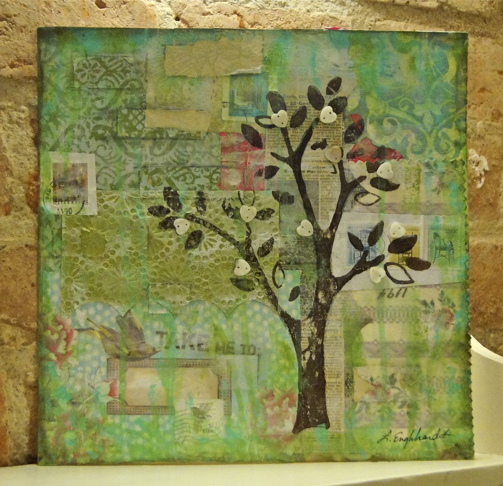
And today I received a fabulous canvas, all the way from the U.S. from Laurel Englehardt. I spent all morning looking at the layers, tones and details. Great colour!
I love every one of my gifts and just love the originality and diversity of each one. 

So there you go - lucky old me and I even treated myself to some new stamps too. Will be showing them off another time. Today I also reached 100 followers!!!
To me, that is a really big deal and I am very thankful and honoured to have you all come along on my journey. I am planning a thank you treat for you all very soon...stay tuned!
That's me all done for today - see you around in Bloggerville or at Simon Says Stamp and Show very soon. Thanks for dropping by - enjoy!

Sarah.

Tuesday, March 1, 2011

Monday Monochrome Moods...

It's approaching midnight and yet again I find myself in the realms of a posting. Even if a day was 100 hours long, I would still be finishing something at one minute to a hundred o'clock...the night and my crafty dabblings seem destined to be together. I wasn't really planning on making something today but I had a image, reached for some ink and there you go. Fell for the charms of minimalism again and joining in at Less is More where the theme is three squares. Chose to explore another avenue in style and mood...
Except for some very inviting red lips, the mood is monochrome. Not pure white...an ever so slight hint of ivory which gives it a bit more subtlety. Just two stamped images from an old favourite of mine from Hampton Arts, layered with a scrap of lace. The card has a fine ribbed texture and I added a black satin ribbon for the sheen. Liking black on black although it is hard to pick up the textures with the camera. Purposely chose to omit a sentiment as I think the imagery is strong enough. I'll save something for on the inside....

Here you can see the ivory tones. Just look at those eyes...I added a smidgen of red to the lips which somehow brings this diva to life.
I just had to make a soul sister and went for another intriguing damsel...This squares are layered on top of some black lace and then I added a narrow piece of satin ribbon. The ribbon actually has a fine herring-bone weave which adds extra detail. The shots are taken on a wooden ledge with one of my favourite dance photography books in the background. Loving the way the two ladies are vying for attention...

Here you can see the images and more of the detail on the ribbon, and another sumptuous pout.


Once again, I thoroughly enjoyed tonight's spontaneous venture. At the risk of trying to sound arty-farty...I just adore everything about paper art and what it does for me. Imagery, tones, composition...savouring, creating, discovering, inspiration, daring and just being. During moments like these - life feels just perfect.
Also joining in with:
Stampin' for the Weekend -Monochrome
Totally Gorjuss - Black and...
Charisma Cards-Black/White/One Colour

Signing off - until whenever,

Sarah.