Yesterday I was looking forward to the simplistic pleasures of another Less is More Challenge and here I am a day later with my take on "Off the Edge". Those of you that know me, have already encountered my "Gotta do more than one" thing...so here is another trio for sharing. As said, it's all a little lovey-dovey. I had some ideas doing the rounds in my head and these small stamps seemed just the ticket...
Now ladies - for all those with whitespaceaphobia, this is as minimalistic as it gets...no brad, ribbon and I didn't even ink the edges! Just stamped the sentiment randomly over the corner with just the one in red.
The letters look rather like that of an old type-writer so I felt I could wing it by hand and not go all precise with the spacing. I think it works and I like the slightly uneven look...like someone just played around in the office. I like how the stamp is the pattern, decoration, sentiment and the focal point! The card-stock has a slight texture. No need for any extras.
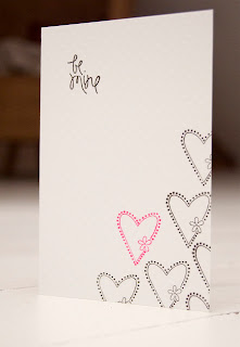
The second one follows the first in some ways. As the heart was a little bigger I didn't need to use so much repetition but it did need it's own sentiment, otherwise it would have been just a pattern. It also helps to balance out the proportions of the rectangular card. I used a small clear stamp set I picked up for a pound in a bargain bin last year! The card-stock is the fabulous dotty one from Bazzill.
The third one was made using glossy card stock. I debated the joys of slipping off this one just at the crucial moment but wanted to go for the shine (hard to see on the piccy). I used Archival ink, not Stazon, as it is less wet and gives more control. It takes longer to dry but it was worth it...
I did hold my breath for most of the stamping and gave myself a wee round of applause after doing the sentiment. This time I added a smaller heart for contrast. I will confess that this is the second attempt, as I botched the very last stamp on the first one - booooo! Almost walked away but couldn't resist the challenge to get it right. Puffing and patience work every time...
 So there we go...all done and dusted again (well - done, dusting...that's for another day). Head on over to the Less is More blog and have a look at the examples by Chrissie and Mandi as well as some great entries this week. Don't forget to read the guidelines first...the ladies are working very hard to achieve a great blog, challenge and level of work. It is also very enjoyable too - getting back to basics and simplicity are good for you. Just need to apply that to real life now!
Oh and this little shot shows the post-it note beginnings of today's adventure...
Thanks for calling by - hope to inspire you in something, somewhere!
Sarah.


VEry creative idea with the word stamps...All three cards are fabulous!
ReplyDeleteI would find it very difficult to choose a favourite Sarah, they are all wonderful.
ReplyDeleteThanks so much for your kind words and support for our blog, it is truly appreciated.
Not long now 'til Saturday and another challenge!
Chrissie
"Less is More"
Hi sarah
ReplyDeletewhat a fabulous trio of cards! I too hold my breath sometimes, hehe isnt it funny You've created a wonderful set
Thanks so much for sharing them with us
mandi
"Less is More"
a great trio of CAS cards
ReplyDeleteLove your tall hearts card. All lovely in their simplicity. x
ReplyDeleteLove your cards. Great job for not giving up. Go you!
ReplyDeletecheers,
Malyn
Beautiful cards, tall heart one is my favourite. x
ReplyDeleteLess is More is looking gorgeous. I particularly like the typewriter font.
ReplyDeleteBx
A fabulous set of cards - love them all
ReplyDeleteOh loved this post...your cards are lovely and I see that I am not the only one that is challenged when something goes wrong! Puffing aye?? ha,ha...
ReplyDeleteHugs,
Cardarian
Fabulous creations! Love the all text one very creative!
ReplyDeleteAli x
Three gorgeous cards. I love the idea of just stamping the sentiment, it works so well.
ReplyDeleteHugs Lisax
Beautiful clean and simple. Very delicate!
ReplyDeleteHere you can say: "Less is more..." Well done.
ReplyDeletexFranka
This comment has been removed by a blog administrator.
ReplyDeleteI love these cards, they are all stunning, xx
ReplyDeleteVery simple but very elegant trio of cards.
ReplyDelete